Some WCG applications, such as the one shown in the screenshot above, are used internally to provide services, so usability and efficiency are a high priority. On this redesign, I worked directly with internal users to create a tool that would help them best do their work by prominently featuring relevant information, and restructuring the workflow so that all steps of their process were accessible from one location in stead of six separate screens.
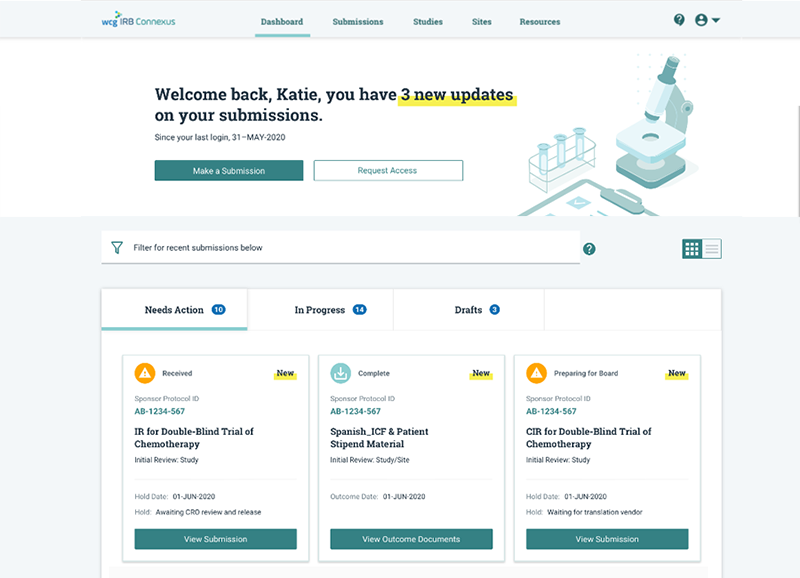
Document Management for Ethical Review
In 2020 and 2021, I directed UX efforts on the full redesign of our system to manage documents for clinical trial ethical reviews. Our goal was to make the experience of this product its primary differentiator in the market.
During the discovery phase, we conducted extensive contextual interviews, then used the findings to prioritize features and make high-level design decisions.
Next, we created concepts and prototypes, holding usability testing sessions throughout the process to refine and iterate on the designs. Testing and feedback continued while we developed, allowing us to make design adjustments even before initial release.
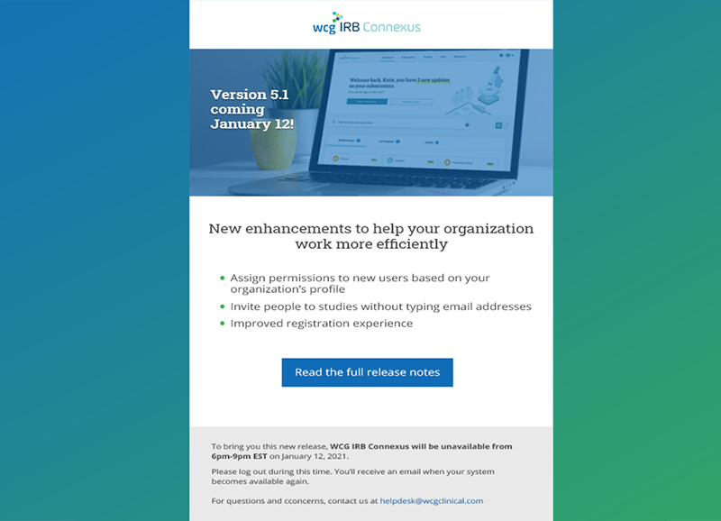
Release Communication Email
Often overlooked, communications from a system or organization are a key part of the user experience. I've led the effort to update wordy, difficult-to-read plain text emails with friendlier, scannable HTML emails by designing and coding items such as the message shown above.
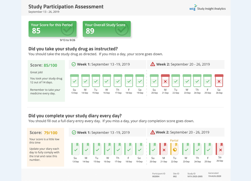
Study Participant Report
Participants in clinical trials need to complete certain requirements, such as taking medicine or filling out a daily diary.
I worked with study participants to design a report that would give patients feedback on the tasks they were responsible for. The report helps patients to easily understand expectations, receive encouragement for doing well, and get guidance when their participation is inconsistent.
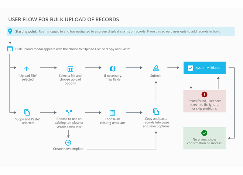
WCG Bulk Upload Workflow
Mapping out workflow is an important part of designing experiences of complex, multistep features. The simple workflow diagram shown is a step-by-step walk through of user interaction with the system when uploading records in bulk.
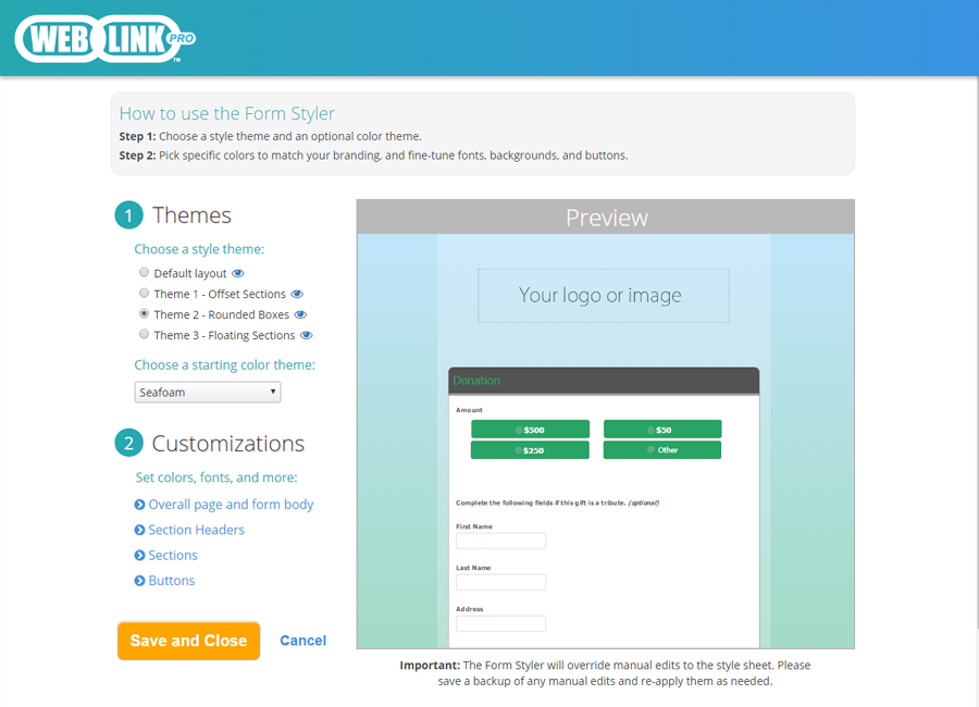
WebLink Form Styler
Customers often complained about DonorPerfect's plain and notoriously difficult-to-alter online forms. So, I led a team that built a tool for clients to customize the styling themselves without knowing any code. The Form Styler is now part of WebLink, DonorPerfect's online forms product.
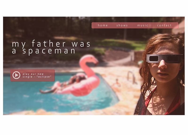
Album Website Concept
Just for fun, I took a picture of my daughter observing a solar eclipse and used it as the basis for the website design of a mock band, with her as the featured performer.
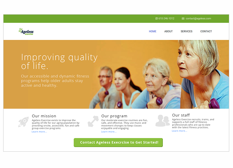
Marketing Site Design
I designed this site (still in progress) for the business of a family member.
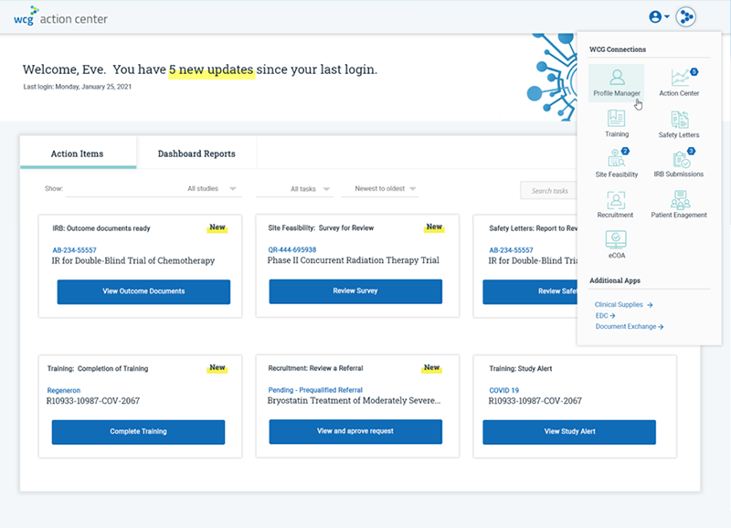
Action Center App
The WCG suite of products was created by different people at different times, resulting in a set of applications that are disconnected from each other and difficult to use together.
We are undertaking a project to systematically standardize look and feel, introduce single sign on, and, make use of an "app-switcher" widget to easily move between products.
These changes will allow for a unified but flexible experience in which users can enter the WCG ecosystem from multiple points and individual applications can surface data from any other related system.
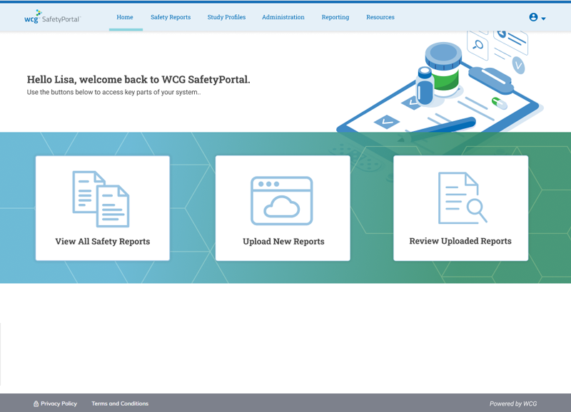
SafetyPortal Landing Page Redesign
The SafetyPortal product was initially released with a landing page featuring a single grid, which was often empty of content. As a result, it was not useful for users and even made it difficult for sales to demo the system.
I proposed a redesign to the Product Manager, with the goal of surfacing important tasks and items. The compromise solution was a redesigned page with an improved look and feel and prominent links to important parts of the system. The large buttons display in different combinations based on a user's role to show only relevant actions.
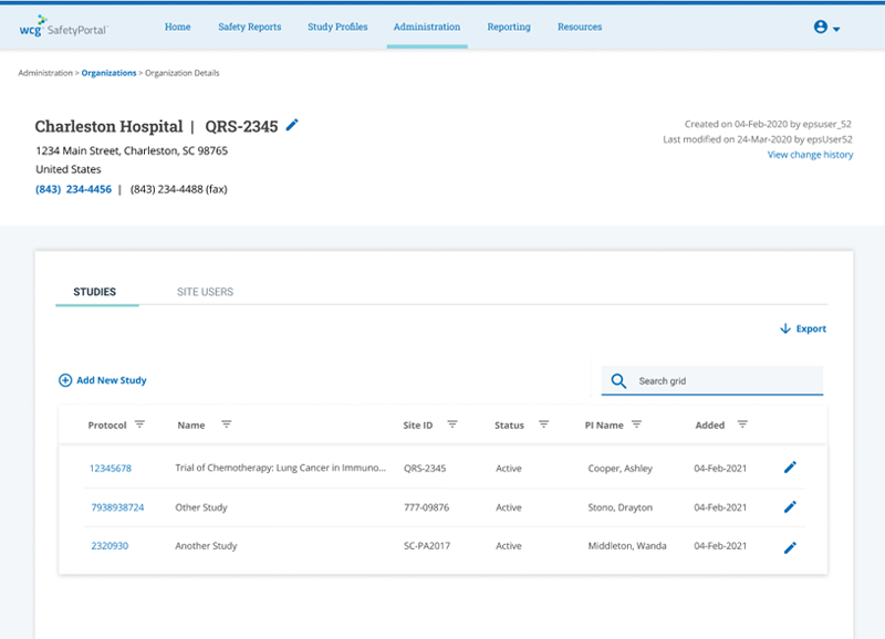
Organization Detail Page
A clinical trial can include hundreds of sites. This page was redesigned to bring together four different pages and give users one place to access information about an organizations that can participate in many studies with many patients.
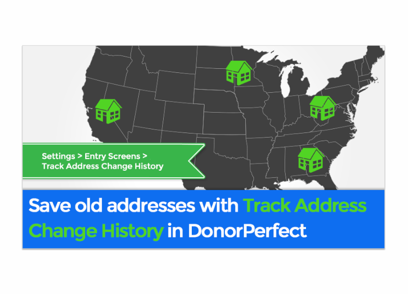
DonorPerfect Blog Post Image
Communicating with clients was another key function of SOfterWare's UX Department. I created images like this for use in emails and blog posts to inform clients of new features included in upcoming releases.
It Only Takes One...
Setting a precedent for change
Problem
Many nonprofits accept gifts from donors given in honor or in memory of another person. This type of gift is called a “tribute,” and DonorPerfect did not have a clear way for clients to enter, track, or inform their constituents about them. Despite a redesign of this functionality a few years previous, Tributes was consistently in the top five case reasons for Support calls.
At the same time, the UX Department had been formed only recently, and this was our first large-scale project. As a result, a key part of my approach involved sharing the methods my team was using to create a better user experience, and convincing stakeholders, including some executives who were still intimately involved in the design process that they should trust the UX team and the validation we were getting from frequent client feedback.
My Leadership Role
In prioritization, we discussed the data we had on this functionality, both quantitative and qualitative, and determined that DonorPerfect’s tributes functionality should be completely redesigned. This was the second redesign in three years, and the business tasked our design team with “getting it right,” so expectations were high.
Over the course of this project, we revamped our development process, and UX was a key driver of these changes. My first action was to organize usability testing and interviews with users. I planned the tests and designed the questions. At the time, this kind of research was new to the company (the UX Department was only about six weeks old), so a top priority was to involve other departments and individuals as observers so they could get first-hand experience with our customers, hear about their challenges, and see the difficulties they had using the application.
After testing and gathering information from users, I wrote reports which were distributed to key stakeholders. I presented this information, explained our methods, and defined the key problems users were experiencing in meetings with stakeholders and executives.
Next, my team and I began to produce wireframes and mockups while collaborating with the Business Analyst on the team to define requirements. For the first time, we had designers working directly with developers to determine if our ideas were technically feasible within our current architecture. Wireframes and mockups went through another round of testing and refinement. I then presented them to the larger team, the product owner, and key stakeholders, including multiple members of our executive team.
Once our designs were approved, my team and I created the HTML and CSS for this feature. Our styling was done so that the new feature incorporated a look and feel that could be temporarily contained only within the new module until a later date when it would form the basis for a much-need reskin of the rest of the product.
As the Development team prepared to release a beta version of the feature, I worked with the content producers on my team to create a beta version of our documentation, as well as promotional/overview materials, including video content, for beta participants.
During the beta, I was on the team reviewing feedback and deciding must-haves to go to production. My team subsequently handled design changes that were fed back into the development process for subsequent iterations of the feature.
Result
This project had positive effects for clients and the company.
There was some initial difficulty with acceptance of the redesigned feature. This reaction wasn’t totally unexpected, since we were breaking some new ground for the product. Users liked the improved UI and process flow, but it was an adjustment for them. A year after the release, however, Tributes functionality, formerly a consistent top-5 case reason, isn’t even in the top twenty reasons for calls to Support.
From an internal perspective, the Tribute project led to several important changes in roles and processes. It established the importance of usability testing early and frequently. The process we used for Tributes is now the blueprint for the design of all new features. The project also began the shift away from a process in which product owners and executives played a very involved role in design decisions and allowed me to show the leadership necessary to build the trust with stakeholders that is so important to a growing organization with new and evolving roles and responsibilities.
Creating a Community
A unique opportunity to lead, learn, and collaborate
Problem
From a strategic perspective, there were two main problems that the company wanted to solve by implementing a user community.
First, to decrease phone support, a better method was needed to provide a means for self-service help, through providing better materials from the company and creating a channel for users to connect with each other.
Second, although the company puts a high value on client feedback and ideas, the way systems had evolved, the channels for feedback and participation were fragmented and siloed. This made it not only more difficult for clients to participate and share, but also had negative effects on the company’s ability to identify and communicate with clients throughout their life cycle as customers.
My Leadership Role
Although there was executive level sponsorship and an abstract vision for the project, there was no one to own it. The project would also be challenging since it had to be done while maintaining our current workload and we had limited experience working with the SalesForce platform on which the Community would be built.
After some initial meetings to discuss the project and an abandoned first attempt by another department to get the project going, I organized a meeting to present to stakeholders my vision and basic plan for making Community a reality. After my presentation, we were approved to move forward with UX as the principal team working on the project and me as the project owner.
The UX team got started right away. I worked out a project plan so that we had guidelines, milestones, and target dates. We had done usability testing previously on our Knowledgebase, so we created some new designs and began testing them. At the same time, we began coordinating with our IT department (our CRM administrators report to the IT Manager) to learn more about the CRM and how we could work together.
In the first six weeks, we made significant progress. But as we moved forward, it became clear that there were problems with the way we were working. After some frank discussions with my supervisor, it was apparent that I was stretched too thin with other projects and needed help. The IT Manager was asked to work with me and split the duties of running the project. Though a disappointment, it was a valuable lesson to me in learning how to deal with situations that are becoming overwhelming as well as how to communicate a change of that nature back to my team. There was much I could learn from the IT Manager, and our first task was to revamp the project plan.
After the changes we made, our teams began to work more harmoniously and have a better understanding of the expectations for the stages of the project. I was able to turn some of my attention away from the design and setup of Community, and better communicate with the members of my team who were creating content. Our strategy was to move our documentation out of the manual-style format it had been in for years, and reorganize and rewrite material to anticipate our users' most frequent problems and help them find the answers they were searching for more quickly. Needless to say, this took a lot of work, and one of my main tasks was to clear space for the team and communicate to others about our priorities. Managing expectations and saying “not yet” to requests gave my team the time necessary to do the best job they could.
As we neared completion of Community, the project became accelerated by an executive who set an arbitrary deadline. Unfortunately, this was not communicated to everyone involved with the project at once, and did not take crucial concerns into account, such as the necessity to coordinate the release of Community with the release of the application. I raised these concerns, and through discussions with principal people involved with the project, got the deadline rescheduled. The additional time also allowed us to complete a few more items that were slated for the second iteration.
Throughout the project, I represented the larger team in our communication efforts. I wrote and sent out all written communication about the project, presented updates on it multiple times during monthly full-company meetings, and gave a special hour-long talk and Q and A to about sixty employees.
It was always in our plans to decommission the old Knowledgebase, but we did not establish a firm timeline since we had confidence that the new one was far better. However, in the two weeks following the release of the new Community, it came to my attention that staff was still sending old Knowledgebase links in their emails and referring clients to old articles on the phone – old habits die hard. I consulted with my team and made the decision to shut down the old Knowledgebase in two weeks. The announcement was not widely welcomed. Both my manager and the CEO discussed their concerns with me, but I determined that my team could address any outstanding issues they had and hit the established deadline. We continued as planned and took down the old Knowledgebase as scheduled with no further issues raised by staff.
Result
When Community was released, no large issues surfaced, and most that did were related to login problems that needed to be solved by the development team. In the months since released, we’ve gotten much positive feedback about Community in our client surveys. The release of Community has also coincided with a 50% drop in the support incidents per client ratio for new customers (defined by having had a system for less than six months).
Iterating to Improve Design
Evolving Through Feedback-Driven Iterations
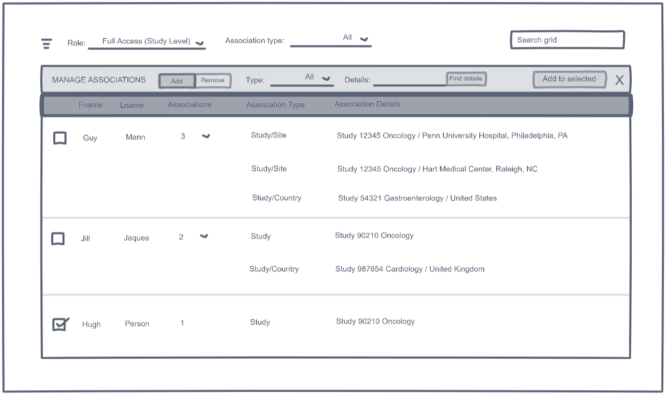
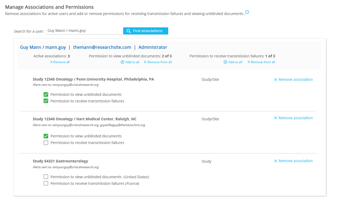
Recently, our team added a new feature to WCG’s SafetyPortal application to help users manage the studies each team member is associated with and the permissions given for each study.
Drafting Initial Ideas
After reviewing the need with the product team along with feedback from users driving the implementation of the new feature, I created a series of sketches. The first sketches were paper and pencil, with subsequent versions done in InVision for easier sharing for feedback.
Iteration one, shown below, was grid-based, with collapsible rows and actions at the top. This iteration was an important step, a necessary draft to make sure key requirements were accounted for and begin to visualize the workflow of the screen.
Iteration 1
In the earliest design phase, I revised the original idea into Iteration 2. I opened up the screen by removing the grid, and opted for one button at the bottom of the list to commit changes. The second iteration also better accommodated both the “associations” and “permissions” management.
Iteration 2
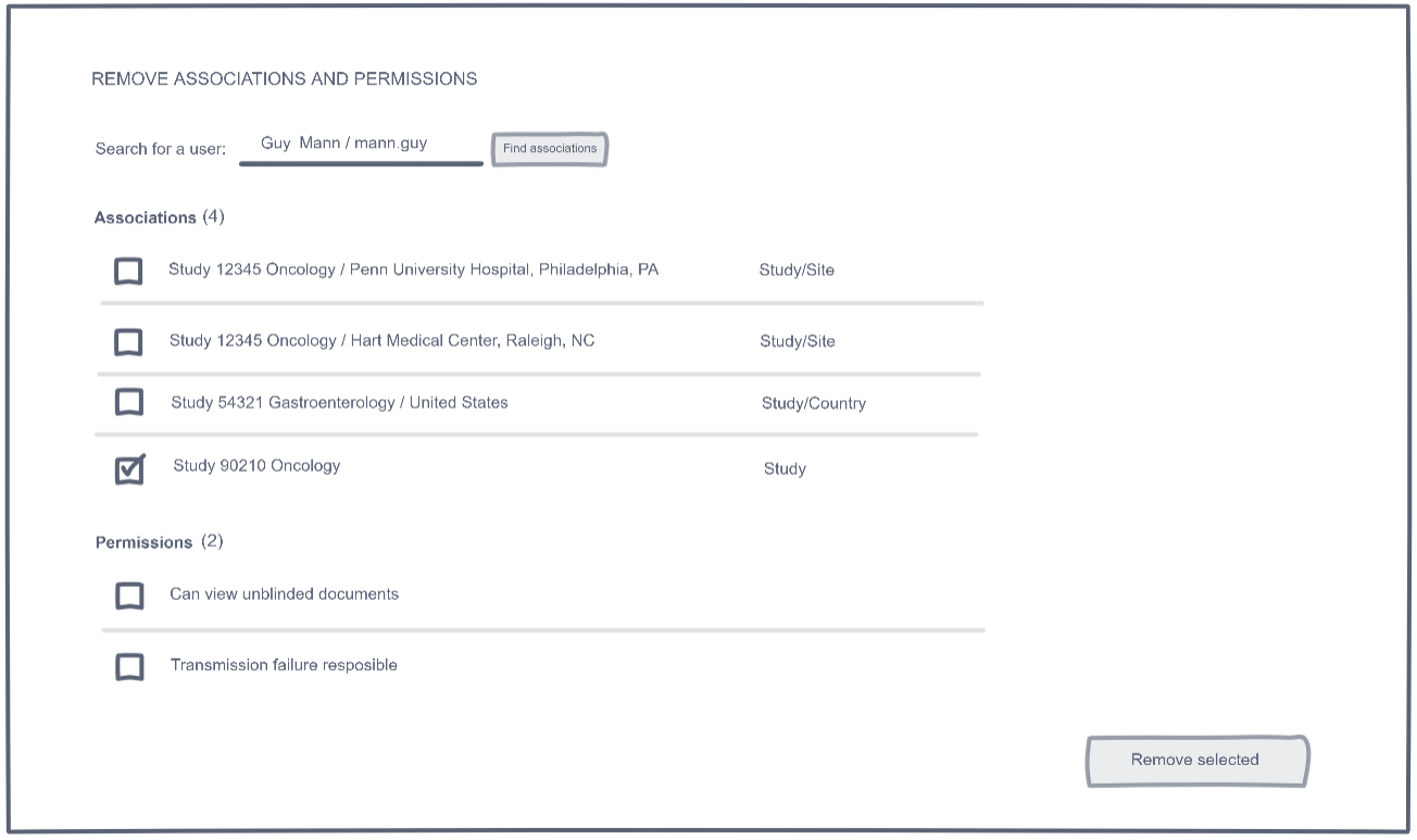
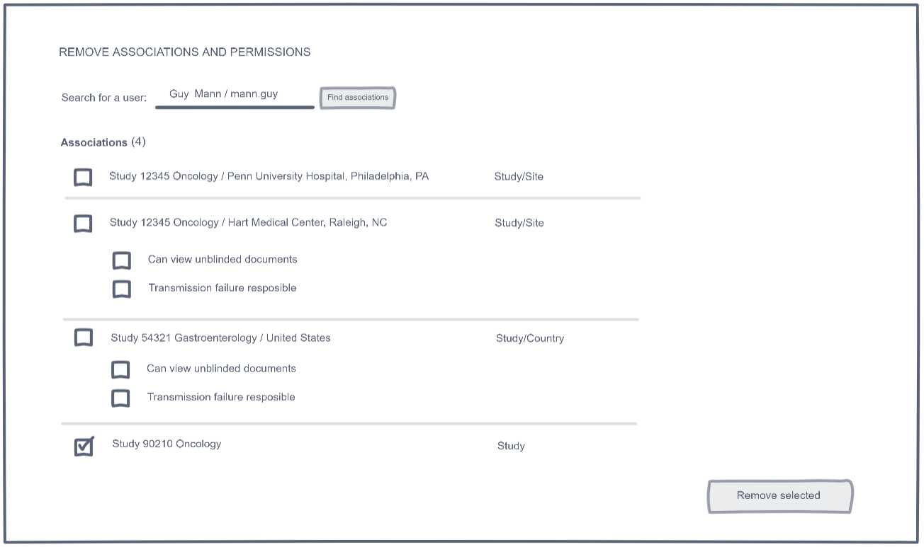
Refining the Idea
After obtaining feedback from stakeholders and internal users, I created a third iteration to more closely relate permissions to the study associations they affect.
Iteration 3
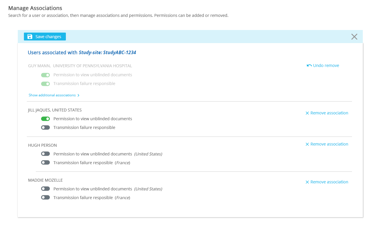
The next step was to create a high-fidelity prototype to share with clients and begin to show how the finish product would look with our style and branding standards applied. In this version, I replaced the checkboxes with switches and moved the “Save” back to the top after testing and feedback showed that it was difficult for users to locate at the bottom of the screen -- even when limited records were returned.
First, the product team added a new requirement: users needed to have the ability to adjust associations and permissions both individually and as a group. To accommodate this need, I added the summary box at the top of the results with group actions built in.
Second, testing and feedback showed some confusion around the switches. Due to a technical limitation, all changes needed to be saved. As a result, switches did not update permissions when they were flipped, which was not the expected behavior. To eliminate confusion and be more consistent with how the different elements of the screen worked, I reverted the design back to checkboxes.
Iteration 5
Wrapping It All Up...
Iteration on an idea is crucial for evolving toward a design that serves users’ needs and meets them where they are. With quick sketches and prototyping, it’s possible to cycle through multiple versions in a short period of time, keeping your best ideas and refining them while eliminating ideas that may not work, or are good but do not fit or don’t suit your users.
The final design for this feature benefitted greatly from several rounds of ideation, feedback, and collaboration with team members and users.
Know Your Users, Improve Your Product
Understanding Users of a Clinical Trial Management System
A project that I completed in the first half of 2019 was the development of a set of user personas for WCG’s newly acquired clinical trial management system (CTMS). Applications of this type are used to track and report on study, patient, and financial information during a clinical trial.
I conducted about twenty interviews, with a representation of clinical site staff in various roles and levels of independent reseach sites and academic institutions. It's not always simple to know when to stop interviewing, but beginning to notice overlap in responses and patterns in interview answers is a good signal to move to the next step.
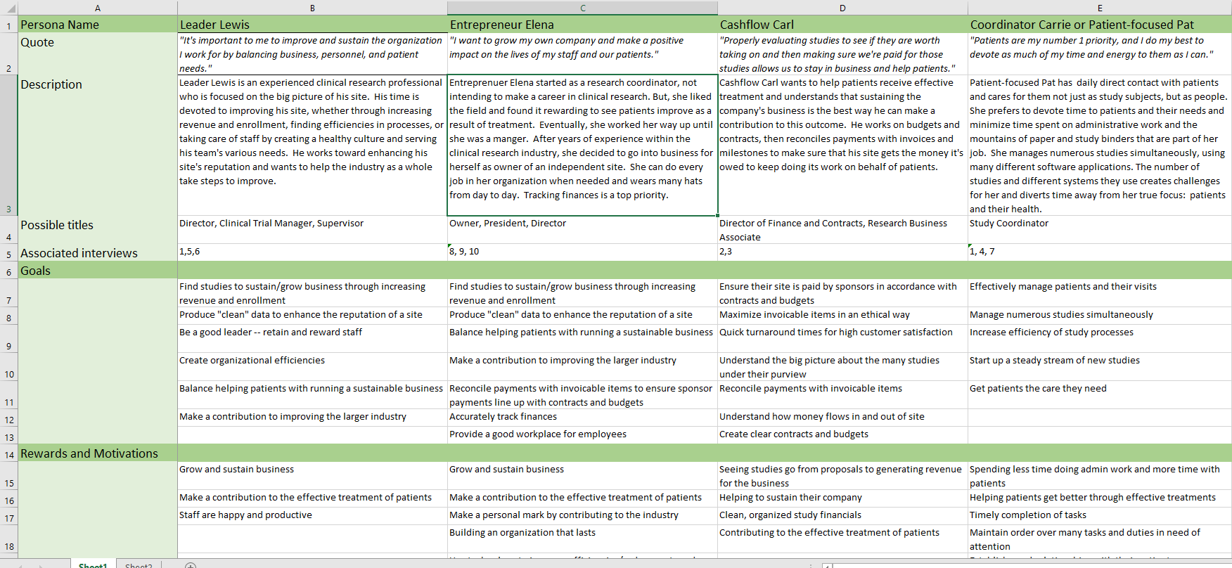
With the interviews conducted and transcribed, I first compiled the information in a quick set of notes with simple pencil and paper. I then organized the notes into a spreadsheet that showed the first draft of the various personas I'd discovered and distributed to various stakeholders for feedback.
A simple spreadsheet to compile information and share with stakeholders
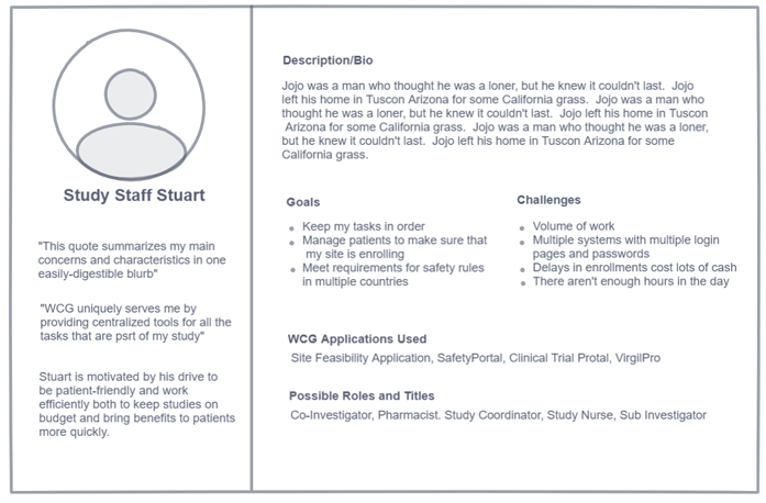
While engaged in the feedback gathering process, I created several sketches in InVision to brainstorm different possible layouts for the finalized personas for sharing. Shown below is the final version incorporating feedback from WCG staff and stakeholders.
Basic layout sketch created with InVision's Freehand tool
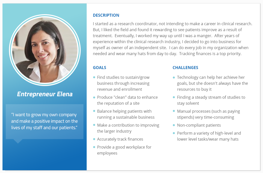
After settling on a basic layout and design, I fleshed out the template and styled it using elements of WCG’s branding for the colors and fonts. An example of finished persona, ready for distribution to the team is included below.
Example of a finalized persona for WCG's CTMS product
The most prominent application of the these CTMS personas is their influence on the creation of a new product offering. Through this research, we identified users that could benefit from a reconfigured, pared-down version of the CTMS that includes a simplified feature set. Without taking the time to get to know the users of the CTMS, it is likely we never would have made this discovery and continued to miss a potentially significant market segment.